Hello There!

Hello there and welcome to my blog that I will be keeping as an online theoretical sketchbook throughout my autumn/winter art project. Throughout this project I will be building knowledge and practice of portrait photography.

Saturday 8 January 2011

Exhibition prep and reflection.

As my exhibition isn't too far away I decided to look for advice on what I could read that would invoke critical thought about Art. I have recently watched an episode of 'The Genius of British Art' where Janet Street-Porter reflected on Modern British Art. Like throughout my studies, this modern era of art always seems to be about controversy in the first instance and I feel like I have already dealt with this in my second year Artist Study of Damien Hirst.

What did grab my attention is the idea of reflection of society and cultural histories. There was an area of art which I approved in my first year but did not feel comfortable dwelling in. This was the concept of 'the Politics of Art', in my first year during a tutorial it was recommended that I look at work by Walter Benjamin, who approaches this concept with essays and theory. It was again recommended to me in my third year and now I'm coming to the end of my degree in Art, I thought it would be good practice to try understand some of his theory.

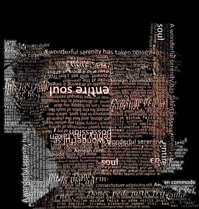
I found and read his essay named The Work of Art in the Age of Mechanical Reproduction. I was recommended this essay during a quick tutorial about reproducing an image, more specifically the photography Afgan Girl by Steve McCurry. I am planning of doing a text portrait of this image for my exhibition to showcase the techniques I have developed throughout this module. As I would be reproducing the image I was advised reading this essay would be useful. The key points I noted:

  • The capitalism in society affects everything, and subsequently Art.
  • Replicas of Art are inevitable because man-made artefacts can always be imitated by man. This replication is usually for a 3rd party who gains. 
  • Modern advances in our world bring about the tools that catalyse mechanical reproduction.
  • The unique existence of the original is always lacked in a reproduction - No history of the piece.
  • This 'Aura of the Original' is removed when reproduced. In example of Afgan Girl I would be removing the history of the piece. I would need to perhaps address this. 
  • Photography is technically a form of reproduction. A very grey art form in his essay. 
  • This has introduced a theology of art and as a result, the concept of politics in Art.
The interesting thing I noted in the essay is how photography is quite a grey area in this essay. Photography is a tool in reproduction but is also an art form itself. I questioned what is the original of a photograph then? the scene? the negative? or the first original production?

In my exhibition I will reflect upon this essay as well as demonstrating several techniques I've worked on in this module.

Friday 7 January 2011

A developing Art Form.

I discovered a dedicated application that gives the user easy-to-use tools that aid the development of image production with text. It's called Artext, and displays how important font design is in the graphic design business. Creating or morphing an image through the use of text is still a new and developing form of art used for business, education and creational purposes.


Thursday 23 December 2010

Other Techniques,

Some of the techniques are very difficult and complex to practice. They rely a lot on the picture being of good quality and ideal lighting. It is difficult for me to capture that 'perfect' portrait of myself to apply the process of a text portrait from a tutorial, available at http://bestbookmarks.net/photoshop/typographic-portrait-in-photoshop [Accessed 22-12-10].


This is a picture of the desired effect. I think it still looks too much like the original portrait with hardly any generation from the text. I wanted to practice this method so that if I understood it, I could implement and merge it with other methods to create some different. However, this method separates itself by using specific file types and tools that rely on dedicated layers.

After some practice this is my attempt:


It went wrong for me as I didn't use enough text, nor could I understand the layer priority enough to make a viewable portrait.

I moved onto another technique developed from http://10steps.sg/tutorials/photoshop/make-yourself-an-amazing-typographic-portrait/ [accessed 23-12-10]. The outcome of the process provides a text portrait like this one:


This process is more understandable and allows for more room to alter the original image to make it more suitable to work with...


 My first attempt at this process wasn't as successful as I would have liked but I have gained enough confidence in my practice to try it again, maybe think about making a final piece out of this method.


 I tried to make a more comprehensible portrait by increasing the visibility of key facial features like mouth, nose and the eye area. The fill pattern in the background is more dominant over the text brushing, which for some reason disappeared when the fill layer was made. I just need more practice and patience with this method.

Tuesday 21 December 2010

Practice..

To gain experience creating Textportraits in Photoshop I created a few pieces using pictures friends offered me to work with.

They are created through guidance of this tutorial :

Cross, D. A Picture Worth a Thousand Words. Available at http://layersmagazine.com/photoshop-cs4-a-picture-worth-a-thousand-words.html [Accessed 20/11/10]


These were helpful to make because they made me consider the resolution of the image you are working with, especially as I hope to be printing some final pieces out in A2 format. Also, I tried playing round with a different background other than just plain white so added a background image of white crumbled paper. It gives an interesting effect but the striking contrast a bold white background gives is the best look to be utilised. 

Monday 20 December 2010

Making a Text Portrait..

I found many useful hints and tips to progress into making a text portrait. As with most graphic design, it seems that Adobe Photoshop is the best application to achieve the results I seek. I visited many helpful websites, which can be found listed on the 'Websites visited' page.


The main process involves importing a picture into Photoshop and then extracting shadow and mid-tone layers, these are important because they form the main parts of a portrait to ensure the image is conceivable at the end. I have discovered two main methods of constructed a text portrait, both I feel give differing effects. The desirable effects are separated by two differing functions of art. I believe one, for example a text portrait I made below:


Wednesday 15 December 2010

Grammys 2009

I discovered that for the Grammy Awards of 2009 there were great examples of text portraits used for the promotional posters. They all featured a series of music artists or bands where their image/portrait was created out of text. Below are some examples of the pieces:


From the posters we can see that the title of songs from all kinds of different artists form the portrait of one particular bands/artist. I think an interesting analysis of the posters is that they are implying that all the musicians influence each other and all collaboratively construct the music they make. It's quite a Post-Modernist view but I think it's cleverly done.


Saturday 11 December 2010

Different ways with Typography.

During my research and practice of different ways of working with text portraits I discovered some work by an artist called Eugene Lvovsky. His collection of work falls under the name 'Type Is...', which is made out of a series of portraits of a woman. From his website I gathered he hand crafted the pieces by carefully arranging letters to form the face in the portrait.

Lvovsky, E. 2010. Type is Beautiful. One colour scheme of Three. 
 Type Is... A series created entirely out of your favourite typefaces, where every single letter placement is perfected by hand, creating a visually intriguing relationship between each character with respect to its unique shape. The flow of every piece is meant to challenge the viewer's eye – encouraging it to travel around the image, thus endlessly discovering it piece by piece. Each nook and crevice will help you find new appreciation for form and the beauty of the typographic character.


The above text is past from his website, http://www.eugenelvovsky.com/typeis/index.html. It's interesting to see this type of text portrait because it looks more aesthetically pleasing than the first process of text portrait I've worked with. There is more use of colour and thought into text placement, the artist has control over the font style of each character. Lvovsky mentions that his portfolio of work includes web design and graphic design, and as I'm currently studying web design I have begin to recognise the importance of Typography in web design. I think it makes sense that graphic designers approach text portraits with a heavy aesthetic content in mind. It provides a big contrast when compared with Ralph Ueltzhoeffer's work, which has heavy contextual content. I have always found this battle of aesthetic and contextual value in art work intriguing, which should you appreciate more?