Hello There!

Hello there and welcome to my blog that I will be keeping as an online theoretical sketchbook throughout my autumn/winter art project. Throughout this project I will be building knowledge and practice of portrait photography.

Thursday 23 December 2010

Other Techniques,

Some of the techniques are very difficult and complex to practice. They rely a lot on the picture being of good quality and ideal lighting. It is difficult for me to capture that 'perfect' portrait of myself to apply the process of a text portrait from a tutorial, available at http://bestbookmarks.net/photoshop/typographic-portrait-in-photoshop [Accessed 22-12-10].


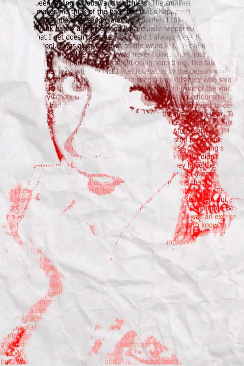
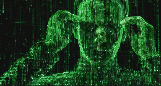
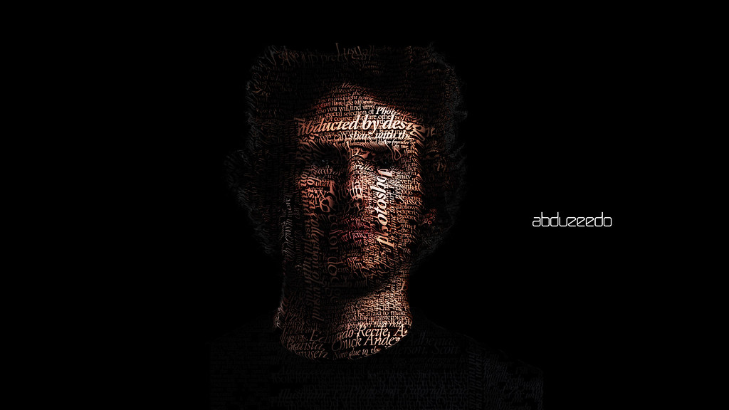
This is a picture of the desired effect. I think it still looks too much like the original portrait with hardly any generation from the text. I wanted to practice this method so that if I understood it, I could implement and merge it with other methods to create some different. However, this method separates itself by using specific file types and tools that rely on dedicated layers.

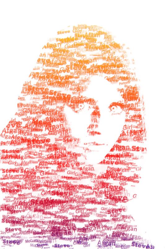
After some practice this is my attempt:


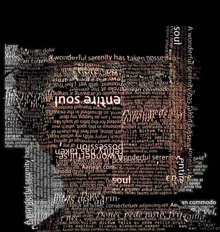
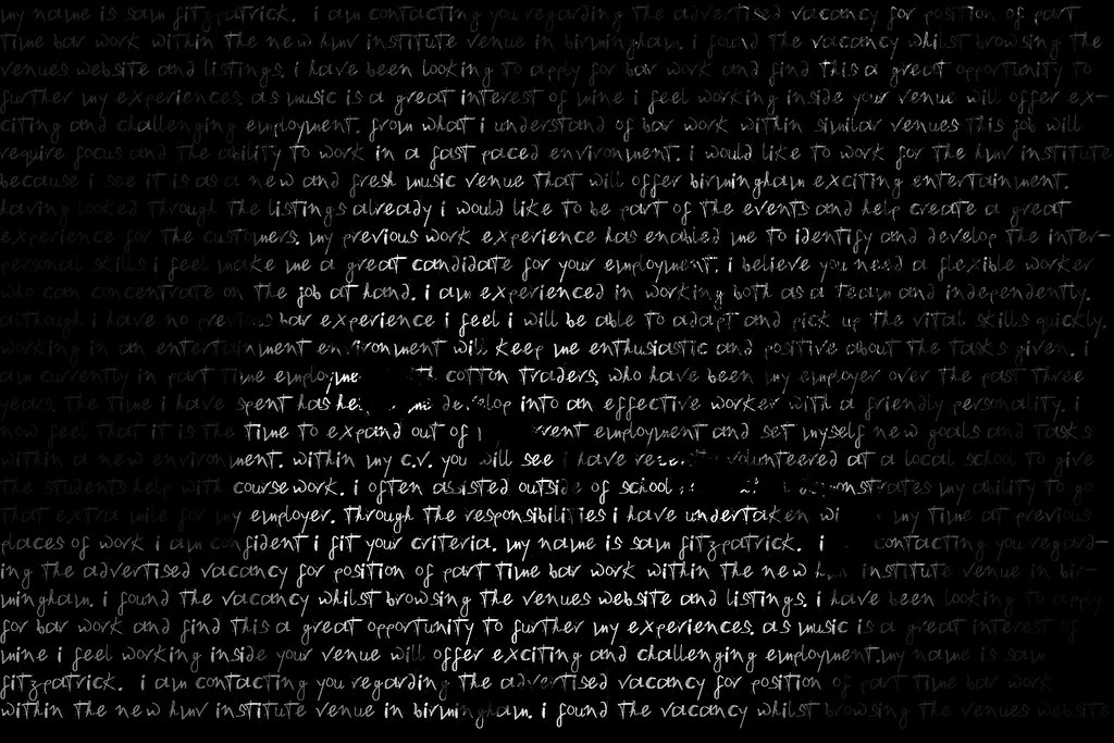
It went wrong for me as I didn't use enough text, nor could I understand the layer priority enough to make a viewable portrait.

I moved onto another technique developed from http://10steps.sg/tutorials/photoshop/make-yourself-an-amazing-typographic-portrait/ [accessed 23-12-10]. The outcome of the process provides a text portrait like this one:


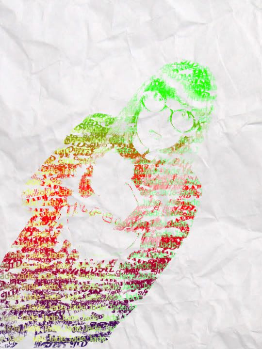
This process is more understandable and allows for more room to alter the original image to make it more suitable to work with...


 My first attempt at this process wasn't as successful as I would have liked but I have gained enough confidence in my practice to try it again, maybe think about making a final piece out of this method.


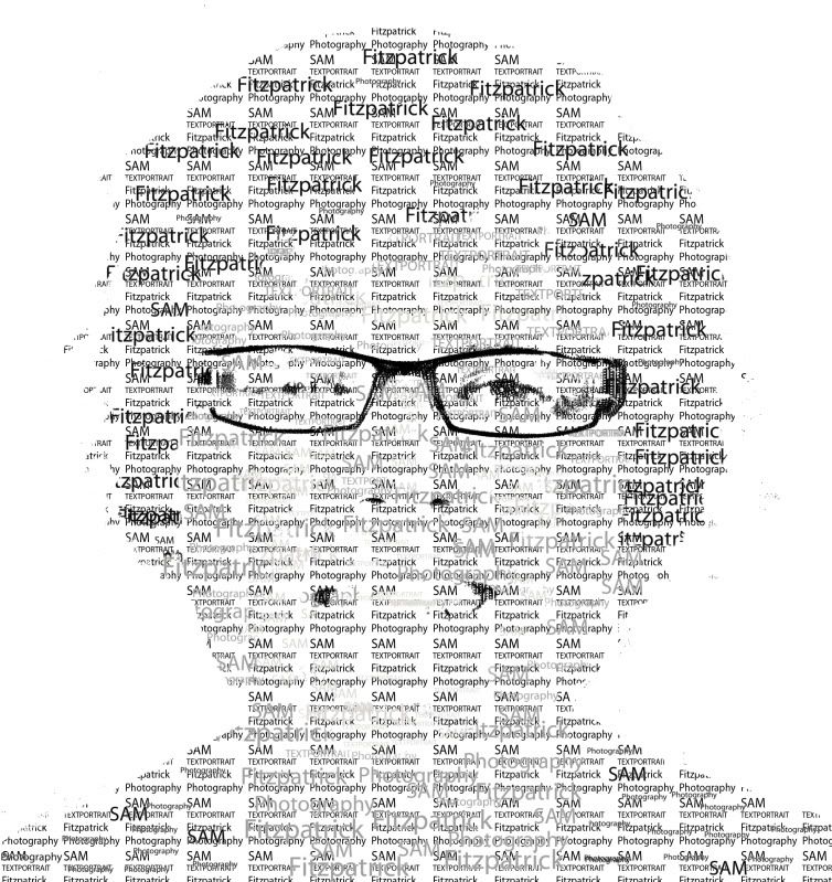
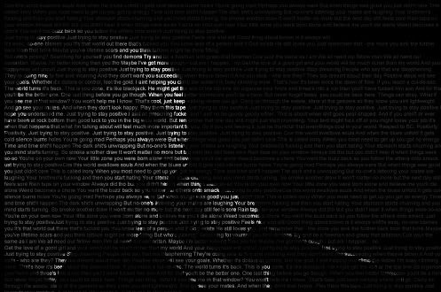
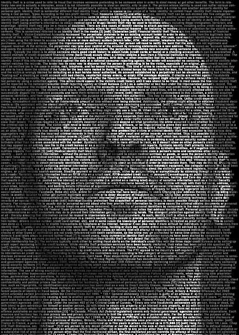
 I tried to make a more comprehensible portrait by increasing the visibility of key facial features like mouth, nose and the eye area. The fill pattern in the background is more dominant over the text brushing, which for some reason disappeared when the fill layer was made. I just need more practice and patience with this method.

Tuesday 21 December 2010

Practice..

To gain experience creating Textportraits in Photoshop I created a few pieces using pictures friends offered me to work with.

They are created through guidance of this tutorial :

Cross, D. A Picture Worth a Thousand Words. Available at http://layersmagazine.com/photoshop-cs4-a-picture-worth-a-thousand-words.html [Accessed 20/11/10]


These were helpful to make because they made me consider the resolution of the image you are working with, especially as I hope to be printing some final pieces out in A2 format. Also, I tried playing round with a different background other than just plain white so added a background image of white crumbled paper. It gives an interesting effect but the striking contrast a bold white background gives is the best look to be utilised. 

Monday 20 December 2010

Making a Text Portrait..

I found many useful hints and tips to progress into making a text portrait. As with most graphic design, it seems that Adobe Photoshop is the best application to achieve the results I seek. I visited many helpful websites, which can be found listed on the 'Websites visited' page.


The main process involves importing a picture into Photoshop and then extracting shadow and mid-tone layers, these are important because they form the main parts of a portrait to ensure the image is conceivable at the end. I have discovered two main methods of constructed a text portrait, both I feel give differing effects. The desirable effects are separated by two differing functions of art. I believe one, for example a text portrait I made below:


Wednesday 15 December 2010

Grammys 2009

I discovered that for the Grammy Awards of 2009 there were great examples of text portraits used for the promotional posters. They all featured a series of music artists or bands where their image/portrait was created out of text. Below are some examples of the pieces:


From the posters we can see that the title of songs from all kinds of different artists form the portrait of one particular bands/artist. I think an interesting analysis of the posters is that they are implying that all the musicians influence each other and all collaboratively construct the music they make. It's quite a Post-Modernist view but I think it's cleverly done.


Saturday 11 December 2010

Different ways with Typography.

During my research and practice of different ways of working with text portraits I discovered some work by an artist called Eugene Lvovsky. His collection of work falls under the name 'Type Is...', which is made out of a series of portraits of a woman. From his website I gathered he hand crafted the pieces by carefully arranging letters to form the face in the portrait.

Lvovsky, E. 2010. Type is Beautiful. One colour scheme of Three. 
 Type Is... A series created entirely out of your favourite typefaces, where every single letter placement is perfected by hand, creating a visually intriguing relationship between each character with respect to its unique shape. The flow of every piece is meant to challenge the viewer's eye – encouraging it to travel around the image, thus endlessly discovering it piece by piece. Each nook and crevice will help you find new appreciation for form and the beauty of the typographic character.


The above text is past from his website, http://www.eugenelvovsky.com/typeis/index.html. It's interesting to see this type of text portrait because it looks more aesthetically pleasing than the first process of text portrait I've worked with. There is more use of colour and thought into text placement, the artist has control over the font style of each character. Lvovsky mentions that his portfolio of work includes web design and graphic design, and as I'm currently studying web design I have begin to recognise the importance of Typography in web design. I think it makes sense that graphic designers approach text portraits with a heavy aesthetic content in mind. It provides a big contrast when compared with Ralph Ueltzhoeffer's work, which has heavy contextual content. I have always found this battle of aesthetic and contextual value in art work intriguing, which should you appreciate more?


Friday 10 December 2010

My first try following the tutorial in my previous post.

This is the outcome of my attempt of a text portrait through photoshop. It is of myself with the particular contextual value of the text being a covering letter for a job I applied for in September. The text is describing who I am, what I do and why they should hire me. I hate writing stuff like this, but it often makes us who we are, and shapes the jobs we do.

The closer you are, the more text you can read. The further you are, the more of me you can see.

Monday 6 December 2010

Making and Text Portrait..

After looking through all the examples of Ueltzhoeffer, I decided to create a text portrait of my own. I found a good tutorial on how to create a similar effect to Ueltzhoeffer's work, it's not the same process but ultimately creates the same outcome.

The tutorial can be found at http://www.photoshopessentials.com/photo-effects/text-portrait/page-4.php.

The process involves converting a portrait picture to black and white. You then create a new layer and fill it with black. After this is done we then create a new text layer spanning across the whole image. Then you paste the text into this layer and re-size the text so it covers everything. When the text is done you then add a mask layer to the text layer. You copy the original black and white image from the first layer and paste this into the mask layer on the text. The result you are left with is a very similar outcome to that of Ueltzhoeffer's work. You may need to add more layers and tweak with the brightness but you essentially have a text portrait.

Your layer menu should look something like this:


Reference list:

Patterson, S. Photoshop Text Portrait Effect. Available at http://www.photoshopessentials.com/photo-effects/text-portrait/page-4.php [Accessed 06/12/10]

Saturday 27 November 2010

Reminds me of..

Whilst thinking more about Text Portraits I started to get reminded of scenes from the Matrix Trilogy. Throughout the film, scenes are often depicted through arrangement of text or symbols. It relates to the whole concept of online and digital data, there are no pictures on the internet, just codes of letters and numbers that tell the computer how to arrange this code into the image we see. I think this plays hand in hand with the whole concept of a text portrait project. Everything you can find in relation to a person can produce their identity just as good as a portrait picture of them.


It leads me on to think about the ease of identity fraud in the digital age we now live in. With all the personal details we give about ourselves to social media, it's easily available and accessible on the internet. A piece by Ueltzhoeffer addresses this link in widespread accessible personal details and the identity of someone.

Textportrait - Textimages "IDENTITY" (2009) by Ralph Ueltzhoeffer.

Zoomed in:


Thursday 18 November 2010

Text Portraits - Ralph Ueltzhoeffer

From the beginning of my project I have developed along the concept or portraits and in particular, wanting to focus around photography. One day whilst researching for ideas and influences one of my classmates discovered a piece of work that looked amazing. I instantly was amazed by it and knew that I had just found my focus for my Art Work. The work was by Ralph Ueltzhoeffer, the producer of one of the first text portraits like the example below.

Ueltzhoeffer, R (2002) David Beckham Portrait. [Digital Image]

The above image uses a story of details of David Beckham, perhaps from a Wikipedia entry, and then uses the text gathered to produce a portrait image of David. The way this is achieved is by the text adjusting colour to change with the contours and details of the subjects face. Here is a collection of other work by Ralph Ueltzhoeffer.

Ueltzhoeffer, R (2009) Celebrity Portraits. [Digital Images]

As you can see they all follow the same design of relevant text forming a portrait of the celebrity. The whole series of work plays around with the idea of identity and the documents of word that are created around us create who we are: our credit rating, job title, name, place of birth. They all arguably form more of your identity than your own face.

Here is some more information about Ueltzhoeffer's project from his project website, http://text-portrait.ueltzhoeffer.com/about/.

Text portrait – a symbiosis out of text and photo, biography and portrait (PHOTO).
A portrait is a painting, a photo, a sculpture or another artistic display of a person. The intension of a portrait is, next to the display of the physical similarity, is also to express the character, respectively the personality of the portrayed person.
If you now extend the basic requirements of a portrait by the name, the biography, the finger print, an iris scan or the DNA, the portrayed person becomes more and more recognized without a doubt among a multitude of people. Therefore, the society can easily respond the needs of an individual.
A text portrait can start off with the NAME, the BIOGRAPHY or the PHOTO. Only the combination (symbiosis) of the single components form it to a text portrait.
Text portrait – what is that?
A text portrait is a version of lettering and photo of a usual portrait, with the difference, that the text (e.g. biography) and the photo (e.g. passport picture) create an inseparable symbiosis. The fusion of two visually different components to a readable portrait – the text portrait.


References:
Ueltzhoeffer, R (2009) Text Portrait Project. Available at http://text-portrait.ueltzhoeffer.com/about/ [Accessed 18/11/2010]

Monday 15 November 2010

First Tutorial

After researching through various online sources offering help on portrait photography I started wonder what else I could do with portraits. During our first tutorial as a class we all shared our ideas with each other and then with help from our lecturer started to build a foundation for development.

In the tutorial I explained how I wanted to play with perceptions and the way the viewer looks at the work. I wanted to explore the different ways in which we physically look at it (e.g from different points in the room) and ways in which the context alters our perceptions. I was advised to look at the artist Patrick Hugues who creates pieces of work that rely on lighting and shadows to manipulate the perception of his art. Ranging from use of painting, collage, 3D installations and prints, Patrick has a vast amount of his work displayed on his website.


Hughes, P (2010) The Palace of Alice. [Oil on board construction]


From this piece of his work it can be seen how Patrick makes use of angles, lighting and shadow to create the illusions that you can go into the piece and really explore around it. He has been the subject of a published book titled 'Perverspective'. It describes how Patrick successfully makes the viewers mind animate his pieces to twist and bend to make you feel like you are on some perceptual freak-out.

Hughes, P (2005) All-out Mondrian. [Oil on board construction]


It reminds me of how portrait paintings are said to have eyes that follow you across the room, constantly looking at you. I think portraits are fun to play with because they will create a strange feeling when the perception of a face is changed by the form and creation process. A face is usually a shocking and sometimes eery thing to discover in formations of many natural occurrences.

Monday 8 November 2010

Steve McCurry Exhibition @ Waterhall Gallery in Birmingham

After deciding to look at doing portrait photography I took advantage of the opportunity to go to the Steve McCurry exhibition at a local gallery, the Waterhall. His exhibition, titled 'Retrospective', features around 80 pieces of his work throughout his career.
  
"His coverage of the Russian invasion of Afghanistan in the 1980’s, when he crossed the border disguised as a local with rolls of film sown into his clothes, won him the Robert Capa Gold Medal for Best Photographic Reporting from Abroad Showing Courage and Enterprise. He has also won numerous awards including the National Press Photographers' Association award, Magazine Photographer of the Year and an unprecedented four first prizes in the World Press Photo contest."
BMAG, (2010), 'Last chance to see 'Steve McCurry - Retrospective' exhibition!' available at http://www.bmag.org.uk/news?id=124 (accessed 08/11/10)

McCurry, S (1984) Afgan Girl [photograph] Retrospective.
A lot of his work has been portrait photography so it was a great chance to see influential pieces from a world renown photography. The above picture, Afgan Girl, is his most famous and led him to the achievement of many awards after it was first featured on the front cover of National Geographic magazine in 1985 (Newman, 2002).

I found the exhibit very motivational and moving. The breadth of work on display shows how a photographer can master photography, most importantly portrait in the case of my project. It's quite inspiring to see the quality in these large reproductions considering how long ago the original photographs were taken. With closer inspection of the pieces it is also interesting to consider that most of them are all captured on film cameras and not digital. I left admiring the work of this exhibition and set me off in motion to try and find a specific area of portrait photography to work in.


Reference List
Newman,C (2002) A life revealed. Available at http://ngm.nationalgeographic.com/2002/04/afghan-girl/index-text (Accessed 08/11/2010)

Monday 1 November 2010

The Start

I have decided to do another project within photography because I find the discipline very broad and interesting. There are many specific elements of photography that an artist can practice and master in. Previously, I have never really thought about photographing humans in portrait scope. People may have been part of previous photography as part of the scene but never as a key subject. My previous photography project of HDR photography was largely based on landscapes so although I'm using the same initial tool for my art project, the art which I am crafting will be different.Along the way there will be continuous development of work from a new and strange practice.

I'm looking forward to see what this project develops into to and where I take it.